


Nitraflex Advanced
Designed packaging concepts for GAT Sport’s Nitraflex Advanced pre-workout, designed to visually capture the product’s core promise of explosive energy, focus, and performance. The original packaging felt cluttered and dated, relying on excessive copy and a chaotic layout that diluted the product’s impact and made it difficult to quickly understand key benefits. It reflected a legacy sports nutrition aesthetic that no longer resonates with today’s consumer.
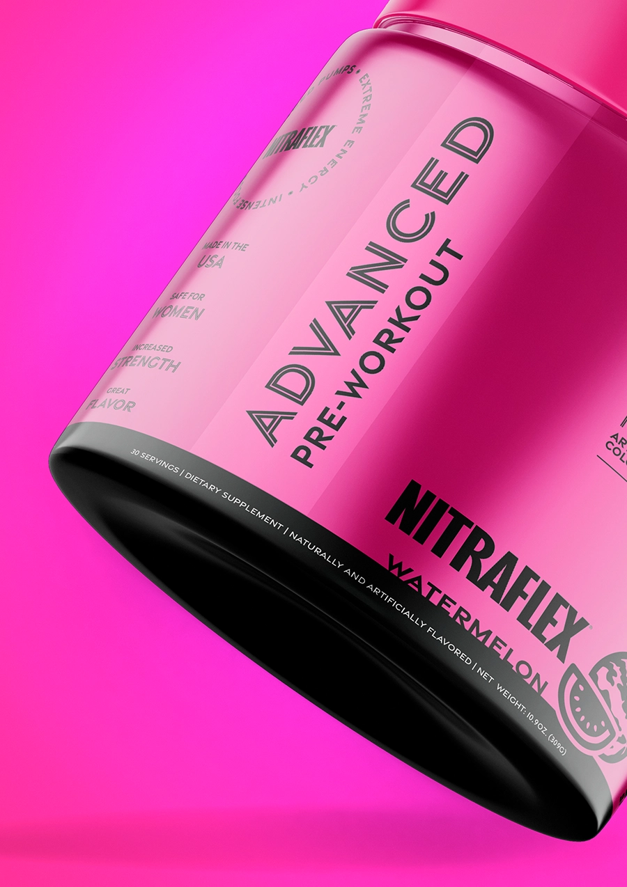
Known for its high-stimulant formula and intense workout benefits, the updated designs lean into a bold, energized aesthetic that mirrors the product’s experience. The redesign focused on introducing a clearer hierarchy and creating a more engaging, modern shelf presence.
DESIGN ELEMENTS
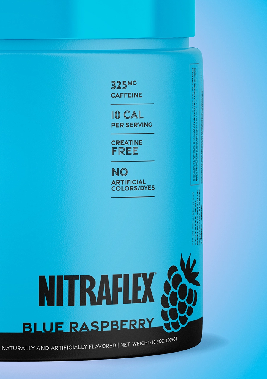
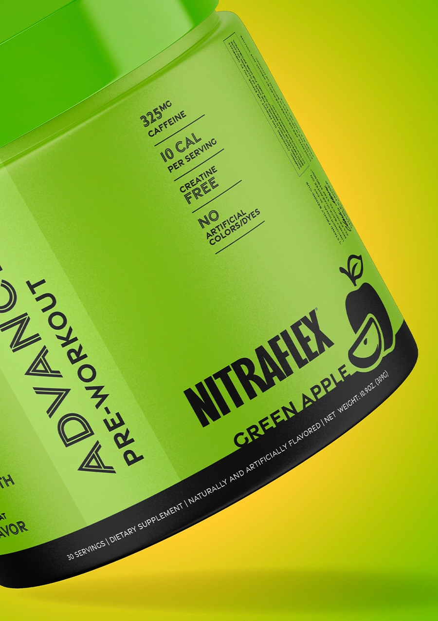
- Color was used more intentionally to differentiate flavors and improve shelf recognition, while typography was refined to feel cleaner, bolder, and more contemporary.
- Product benefits were simplified and surfaced through a more digestible system, allowing the design to communicate performance without overwhelming the user.
- Black and white bottle formats were introduced for each concept, giving the designs adaptability across product variations and retail environments.
OUTCOME
The result is a more focused, scalable packaging approach that balances clarity with energy, bringing a modern, premium feel to the brand while improving usability and shelf impact.
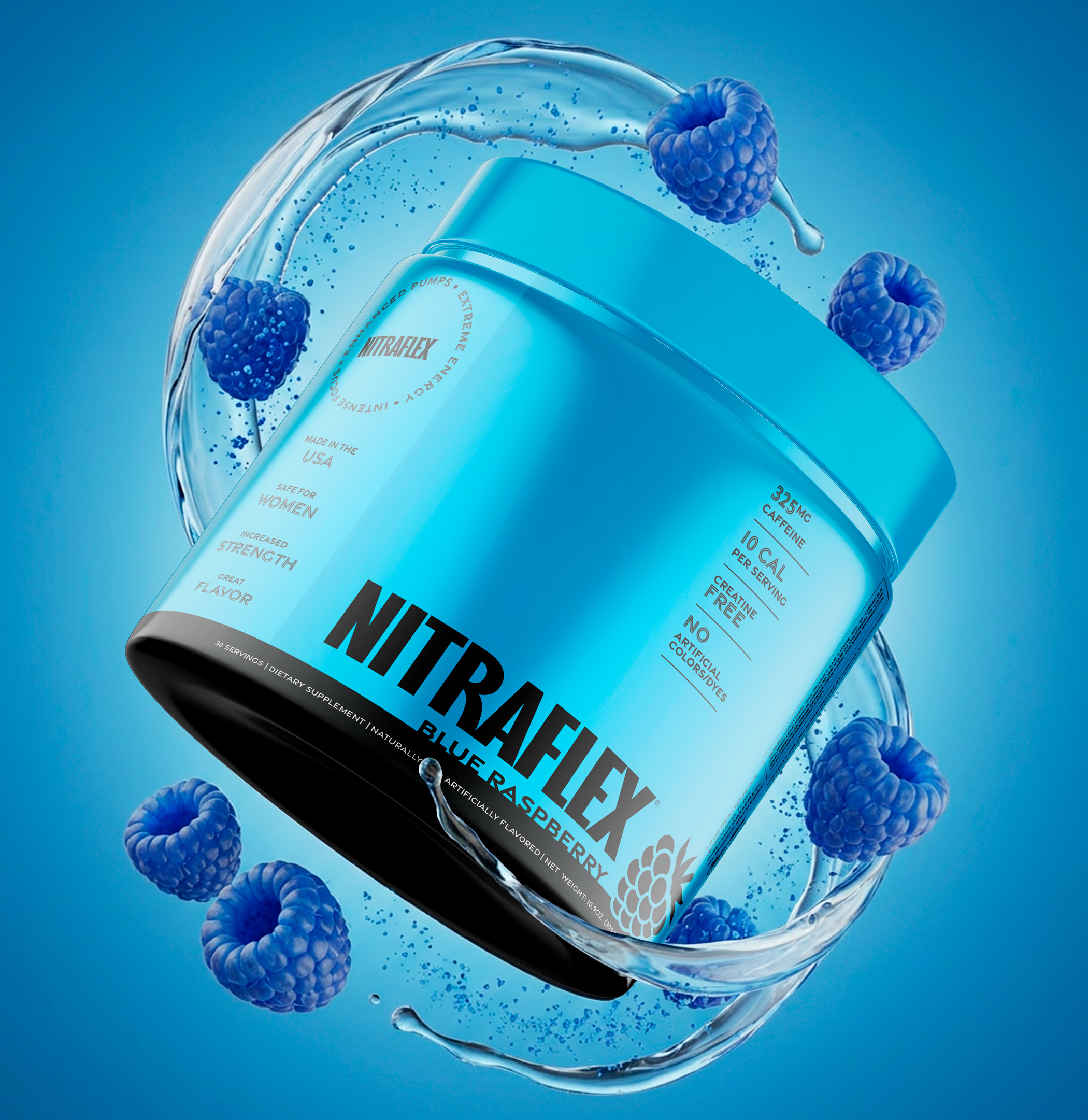
AI-generated Mockups
FINAL (with human editing)
PROMPT FAILS


